
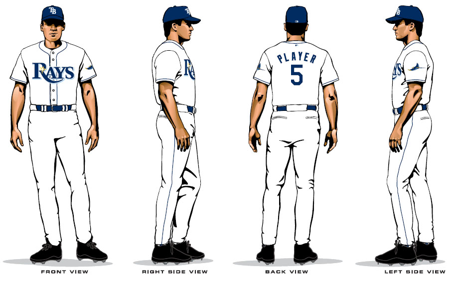
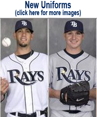
[Update 11.9.07: CLICK HERE for "live" images of the new uniforms on players]
We haven't really had a chance to digest them yet, and will need to see the live versions to make a true assessment. We just hope that the new Unis are not jinxed by the use of the #5. Click on the images for larger and more clear views.
And in case you missed it. We have started a campaign to convince the team to include stirrups with the new uniforms. HERE is the link.
[Update: I have added some thoughts in the comment section]
HOME UNIFORMS
ROAD UNIFORMS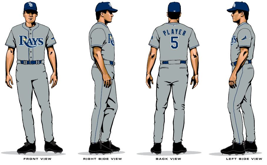
SPRING TRAINING AND BATTING PRACTICE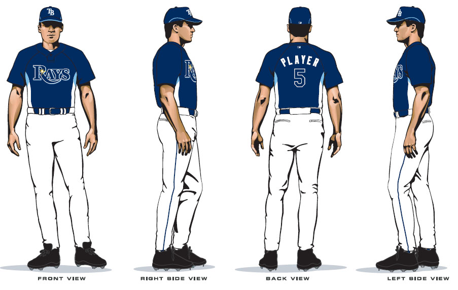 LOGOS
LOGOS

We haven't really had a chance to digest them yet, and will need to see the live versions to make a true assessment. We just hope that the new Unis are not jinxed by the use of the #5. Click on the images for larger and more clear views.
And in case you missed it. We have started a campaign to convince the team to include stirrups with the new uniforms. HERE is the link.
[Update: I have added some thoughts in the comment section]
HOME UNIFORMS
ROAD UNIFORMS
SPRING TRAINING AND BATTING PRACTICE
LOGOSLabels: New Uniforms
posted by The Professor at 9:39 AM
![]()
![]()


137 Comments:
looks kinda like the royals
Here are a few thoughts.
1. I love the new font. Was never crazy about the old font.
2. I kinda like that they are boring and dont look like an Arena Football team. All the classic uniforms are boring. thats why they are classic. Nobody get tired of them.
3. Not crazy about the grey on grey road unis. Maybe Grey jersey on white pants? Not sure. But the all grey with the blue is a bit much.
4. I am glad that they kept the swiming Ray logo as is for consistency, but i could have done without the new splash of yellow on the fish. On the rest of the logos it is fine.
5. And can somebody get me some god damned stirrups!
one more thought.
why do the Jerseys have "Rays" on both the home AND away?
Neither say Tampa Bay
these are horrid-
I like the Navy color. Not crazy about the font, and really don't like the little gold star on the R. The baseball diamond, and I guess the overall font treatment look like something my dad created in photoshop. My dad is 70.
BTW...Paul Lukas of UniWatch has confirmed that these are indeed the new uniforms. He has seen them.
these jerseys look great! classic look. the ray looks great... look at how far has this team come since the multi-color days of vince
I have to agree with rays in '08 and the professor...I like the classic look. Reminds me of the phillies a bit. And call me crazy, but I like the navy/light blue combo (though I've always been a UNC fan, so maybe i'm a little biased). All in all, I think they'll look good once we actually see them live.
I'm getting a sorta seattle mariners vibe with that yellow star thing, Also not crazy about the white pants, but if stirrups or high socks were worn I think it would make them pretty classy uniforms.
call me crazy, but im getting excited for next season. with the new look, the team with one more year of experience, the way the team has been playing the last few weeks!! we are gonna surprise some people next year
It will be interesting to see if the Tribune and the Times report on these now that they have hit the Internets.
I'm guessing NO with the Times bc of their relationship with the team. The trib on the other hand? would they stoop "so low" as to cite a "lowly blog"?
HA!
surprisingly, Marc Topkin actually just posted them at the Times website.
SUCKS! These uniforms are a joke. First - they're boring. Second - royal blue is the ROYALS color. Third - where is the creativity and the progression forward in design as the Broncos did in football and as the Bucs did. Come up with a "new color" or add something that's unique like the Bucs did with the skull and cross bones.
Comment - our uniforms are great as they are. Just drop the Devil from the name and call it a day.
The whole idea of creating a new uniform is the word new. These uniforms are absolutely unattractive and boring.
I think the uniforms are boring and show no creativity whatsoever....it looks like the uniforms were designed by high school kids in art class.
Once again, another bad move by a consistently bad organization.
The new uniforms are OK but not nearly as nice as the current set, especially the home jersey uniform. Also, it looks exactly like the Royals uniforms and the "wave" swoosh on the R in Rays is a little silly. I'm wearing my green gear to next years games. Hopefully I can get some cheap green jerseys in the next few weeks.
You have got to be kidding me with these. I hate the new "color scheme", but we already knew what that was coming in, and what can you do? As far as the uni's though, my god. We look almost identical to the Royals and Dodgers and even the Padres. That sunburst creates an idiotic double entendre with the word Rays, which by the way is now the blandest nickname in all of pro sports. I also find the sunburst ironic since we PLAY IN A DOME. The road uniforms not saying "Tampa Bay" is an insult to everyone in this area, and I'm sick of the team's weak attempts to "regionalize" and bring in places like Orlando and Naples.
As far as boring vs. modern, classic does not = boring. The Detroit Tigewrs uniforms are not boring. The Blackhawks, Packers, etc, all have classic looks without being boring. These uniforms are an absolute disgrace. With the history of this franchise (which I still love), I don't know if I should be surprised or not that all of the build-up and all of the effort and undoubtedly money that went into the process yielded what we see before us today. Just an airball on all counts.
And Cork, a gray jersey on white pants? C'mon, dude.
Bobby Fenton
These may not be the final product. Maybe these are just a few of the ideas that are being thrown out to test the waters a bit. The color scheme is decent at best and I think that the Font is just ok. The gold star isn't the greatest part of the uni. All in all. I'm not impressed. Some great "newer" unis that are fairly popular that could have been used as an example on how to do it right: Seattle Seahawks, Arizona Diamondbacks, Buffalo Sabres, Houston Astros, and the Denver Broncos.
Let me start by saying that I am a big fan of the current Rays uniforms, and feel that they have never gotten their full due. However, what bothers me most about these new uniforms is actually not the new colors but the design. I honestly think that they could have taken the current design and just switched the old green color scheme for the new blue one and it would have been MUCH better.
I have to agree with all of those who said it looks like an amateur did this on Photoshop. The logos with the baseball diamond in the background look like something a little league team would make up.
The little sun looks completely silly, and as already pointed out here leads folks to associate our name with rays of sunshine. This along with the unfortunate decision to remove the word "Devil" officially completes the neutering of our mascot.
Not using "Tampa Bay" on the away uniforms not only looks bad, but could lead some of the more paranoid fans to believe the Rays are leaving their options open when it comes to relocation.
And Cork, a gray jersey on white pants? C'mon, dude.
Yeah, you are probably right on that one.maybe it will be OK when seen on an actual human being.
i think it will also look better on somebody like Aki who wears his pants at the knees.
Thought that the new name was going to be the Tampa/St Pete/Sarasota/Lakeland/Bartow
Unicorns.
once upon a time on this website, we proposed
THE TAMPA BAY DEVIL RAYS OF ST. PETERSBURG NEAR TAMPA, BABY!
the last part is obviously in honor of the Rays most famous fan (Dickie V)
check out www.logoserver.com
keyword Thunder Bay Whiskey Jacks
The TB in Rays looks quite like the TB in Jacks.
Tampa Brays?
I thought they should change the logo, but I have been a fan of the colors. These new colors are boring, not classic. Maybe I will change my mind when I see them for real. So far I am disappointed. :(
I think its all about seeing them live and in person. you can't judge the unis properly from sketches - clothing sketches always look a little weird. I think the color scheme will actually work out well.
I can handle the dropping of "Devil" from the team's name, but question the change from a unique color to one shared by many teams. And I agree with other posters in that not having Tampa Bay on the road uniforms is an insult to the area. Is the new owner of the Rays trying to become Florida's answer to the hated Orioles owner Peter Angelos? The Orioles don't have Baltimore on their road uniforms as they too are trying to expand their regional following.
I hate the new colors. Don't change it. Please. But the change of name to the Rays is good. But the uniforms are hideious. I will not buy any gear with those colors on it I'm sorry
Yet another example of the Rays having an opportunity to do something right and Royally screwing it up. Yes, these unis are dead ringers for the Kansas City club's.
This redesign could have been so much more, but instead management chose to cop out and take the bland route. They should have just gone with a complete identity change and renamed the club the TB Tarpons.
Oh you guys are right, they'd better put 'Tampa Bay' on the front or watch how many of the faithful fans flee.
THESE UNIFORMS REALLY BLOW!!!!!!!!!!!!!!!!!!!!
Hopefully they won't play like the Rangers now that they'll look like them. What the hell was wrong with the forest green? I much prefer that
I hate the new uni's. we look like the m's now, and the green made us unique. and the gold stars are plain retarded.
the new uniforms are awful!
keep the green!
the blue just conforms to the rest of mlb. and that takes away our identity.
keep the green!!!!
Just recently relocated from Chicago and I have to say...Why fix something that ain't broke?! The Tampa Bay green is really nice, unique and different. There is way too much blue in MLB. Come on, whoever made this decision is missing the boat. For a troubled organization, at least the green unis were the best thing going for them. Bad move to go with the new blue unis. No doubt they will not sell as well as the green. Just a bad bad move.
Here we go again. First the lightning screw up their logo and now the rays. The green looks very nice and when you see it, You know its the rays poor poor job keep the ones we have
New uniforms? Ok, they're different, but booorrring! And my biggest gripe is dropping the 'Devil' from the team name! 'Tampa Bay Devil Rays' rolls off the tongue smoothly, unlike, well, just try to say 'Tampa Bay Rays'. Besides, 'Rays' is the most obvious, trite cliché they could have come up with. No originality...oh, we play in Florida; let's see...what about 'The Rays'! Wow..
A new color scheme would have been fine, but this blue/yellow mishmash looks like how many other teams? Ugh!
i don't care what the home team wears as long as we get some support from the home fans!!!!!!!!!
H O R R I B L E
Everything about these are bad, the colors, uniforms, and especially the font.
Just when we got an awesome logo, one that people can wear with pride around town. If we have to change to this, we should just wear the old 1998 rainbow uniforms again because these are as bad as those.
We need to get those guys who made Arizonas new logo, those are sharp.
I just hate that Brian Stokes modeled for these drawings that totally dooms them, I am waiting for the unveiling to make a real decision
This comment has been removed by the author.
The existing Blue/Green unis are the best thing going, as well as the existing TB logo. Although, I could do without the sleeveless jerseys. I agree with those that state that the blue on blue is boring and makes them look just like half the teams out there.
Also, what's the deal with not putting Tampa Bay on the away jerseys. The road team needs to show some civic pride. When in other cities they need to play up being from Tampa...not just some generic Rays team that could be from anywhere.
Gee, blue and white uniforms, how **yawwwn*** original. These lame ass things look like something out of a bad 80's video game.
I agree with a lot of postings, they look a lot like the Padres, Rangers, Mariners, Dodgers, and especially the Royals - which is not a franchise that should be emulated.
As for the Photoshop logo, I think this is actually a stock item from the Sports Authority; "Hi! My over weight softball team needs a logo. We'll take...uhh...how bout this crappy little diamond one?"
The only good thing will be when these lame-ass things hit the market I can get the green Rays jersey they have now for cheap.
On a scale of 1 to 10, these uniforms suck.
The Tampa Royals of '08 - Zzzzzzzz
Hey - crappy uniforms and a dude wearing #5. It's George Brett!!
At first I didn't like these uniforms, but I wanted to wait a few days before I put in a comment. I've now changed my mind...I hate them and they make me vomit.
Good lord these are lame. Why don't they just make the poor Rays wear the original Bad News Bears uniforms? White and yellow with "Chico's Bail Bonds" on the back?
Can Tatum O'Neill still pitch?
There seems to be a thought that sturrips could improve the looks.
I agree.
Make the sturrips huge, elastic and about six feet tall so the Rays can pull them all the way up and over the horrible uniforms
Hey...it was either these crummy things or the old rainbow Astro uniforms!
Signed - Rays Mgmt.
These uniforms have "100 loss season" written all over them
im pretty sure a 5 year old made this on pain
the logo is good but the star is retarded. It looks like pays not rays. The star is garbage.
Why didn't they just have the logo a bolgina sandwich on white bread? That would be about as interesting.
I'm going to hide in the bushes at the Trop in 2008. Anyone who approaches the stadium with these lame things are getting pelted with green paintballs.
I love them, they're perfect.
- Signed, Pat Boone
THE OLD UNIFORMS LOOK BETTER THAN THE NEW IDEA. I HOPE THEY KEEP THE GREEN AND GREY COLOR IN NEW LOOK AND GIVE THE ANIMAL RAY A MAKE OVER. HE LOOKS TO MUCH LIKE A KID CARTOON, AND WHY IS THE "R" IN RAYS HAVE A YELLOW STAR. ITS LIKE ITS SAYING, "HEY BIG BOY COME OVER HERE, I GOT SOME CANDY IN MY POCKET."
At the uniform design meeting:
Bill: Good morning, Chuck. Ready to design the new uniforms?
Chuck: You bet, Bill. I started drinking *really* early today to be at the top of my "game."
Bill: Good one, Chuck! You sure are witty when you drink.
Chuck: Thanks - I'm even a better designer-er when I'm stoned, but I didn't think I should drive in like that 2 days in a row. So here's my idea...
(Chuck puts down his scotch and rolls up his sleeves.)
Chuck: Okay, think drab blue and depressing gray, then bring it down a couple of notches from there.
Bill: I love it! But what about the road uniforms?
Chuck: No no, those *are* the road uniforms. For home I'm thinking stark white. OH - and to top it all off, my daughter will design the lettering!
Bill: GREAT! Diane did graduate top of her class in art school.
Chuck: No I mean Jenny - she's in PM kingergarten so she has time in the mornings to work on it.
Bill: I love it!
Chuck: Oh man I wet myself.
Bill: Let's work that into the trouser design.
Why iz everywun maeking fun of my uniform dezine?!
-Signed,
Billy Simmons
Tampa Elem. School
Grade 3
Well, the uniforms are pretty bad but it's still better than having muratic acid poured on your genitalia
Man, I thought our uniforms sucked.
Signed,
A Padre Fan
Don't switch to these uniforms...I'm warning you.
Love,
OJ Simpson
If the Rays indeed chose these horrible milk toast uniforms in 2008, on opening day I will light myself on fire and traumatize everyone in attendance. My charred carcass will be smoldering on the ground before the first pitch is thrown.
Everyone will ask “My God, why”?
You can tell them; “It was the new uniforms”.
I've seen better colors after that long night of partying back in '92 when I barfed up whatever was in that green beer.
This is ridiculous. Everyone has a different say in this, but I know that there is only one person qualified to design the new uniforms.
Yes, you heard me - ONE person who can give the threads the attention they deserve. None other than...
Mr. Bob Ross
You know him - the "happy little clouds" guy. HE should be heading up this whole initiative.
If he were still alive, that is.
I think this uniform would work if it was like the pirates uniform. It would look great and with high socks, These would rock.
This comes from a Royals fan, I really don't see the similarity to the Royals' unis in these. Except maybe in some way the hat, but even then TB's looks more towards navy than royal blue, and the T and B are separate letters where KC's are drawn together. The rest of the uniform looks nothing like the Royals to me, Royals is scripted font, Rays is all caps new times roman-esque font. Royals have trim on the sleeves and pant legs, these have none. I vote they look more like the Mariners, esp because of the all-caps lettering.
The new TB unis aren't as nice as I was expecting, but they are an improvement over the green and blue designs. I thought the way some of the current TB unis have Rays across the front looked fine, the font was cool.
I am not crazy about the new uniforms. Heck, I think the current uniforms are great! Just drop the "devil" from the name and you're all set. I haven't called them the Devil Rays for years. I've called them a bunch of other names, none of which I'll repeat here.
These uniforms make me angry - I don't know why. I was looking at them when my wife came in and I just snapped and yelled at her. She now is threatening to take the kids and leave me. I'll probably lose my house and be forced to get a second job to pay alomony. All this because of these damn uniforms. This is great...this is just great.
These uniforms make me feel empty inside...kind of like how you'd feel if you lost everyone you've ever loved in a chemical plant explosion. It's like my soul is wandering aimlessly in pergatory. My life is over. Thanks Rays.
The name "Rays" is about as bland as these KC uniforms. Bring back the Devil!
Outside of the logo, colorscheme, design and the hat I think they're fine...
I wish everyone would quit complaining about these uniforms. Some 11 year old worked real hard on these things!
I have a uniform store in North Port. I was able to make this jersey at my shop over the weekend. I made one for my son and he wore it to school this morning. I just got a call from the principal. All the teachers and students hated the jersey - they found it "lured and offensive". He's been suspended for a week.
As I was sitting on the toilet this morning, I had a revelation: Why not make the uniforms smell as bad as they look? I could help -just give me about 10 minutes.
I'm a teacher at North Port Elementary where that kid with the ridiculous jersey attends. I've initiated a hate-mail campaign against his dad's uniform store for even thinking to create a copy of one of the new uniforms. Soon he'll be forced to shut down and his son will have no clothes at all because they'll run out of money and live on the streets.
Good move, Rays. Maybe you can donate the ugly uniforms to the poor kid and his family.
I stopped into my friend's tire shop here in the Sunshine State yesterday to show him pics of the new uniforms. He said that the only thing more ridiculous than the new design is the woman who came into his store a few years ago saying that her tires were "square." He called her a liar and called the cops. I'm about to call the cops on Chuck and Bill.
A prediction:
Game 1, Season opener: an opposing team member calls Crawford a "sissy left-fielder." A brawl ensues. Punches are thrown, blood flies. As Crawford is yanked off the field, he sees the blood spots and says, "There's blood on my uni - is that bad?"
The crowd cheers that it's an improvement.
I had a nightmare a few weeks ago that flesh eating zombies broke through my door, consumed my screaming family and then had me cornered. They were all wearing these uniforms. What does that mean? Well, I'm not really sure - but I just thought I'd share it with you.
Go Rays.
I don't know what I hate more...my little 5 year old brother Timmy who gets everything he wants or these uniforms.
What? My little brother Timmy designed these uniforms?
Well now what the $@*%! am I supposed to do?
After showing my son these uniforms he told me he was going to go on a hunger strike until they switched to something less lame. He hasn't eaten in almost a week. He looks awful. I told him I thought this was a bit extreme, I mean, their only baseball uniforms for God's sake. He just told me I was a lousy father and to leave him alone.
Man, I just don't get kids these days.
When I was a child growing up poor on a farm in Italy, mama always told me never to let anything go to waste. "Never let anything go to waste," she said. Then she'd smack me on the head with her wooden spoon because I deserved it for thinking about letting things go to waste.
Anyway, if dear mama were here today (she's vacationing in Cancun), she'd smack whoever designed these uniforms with her wooden spoon...because they deserve it.
As a lifelong die-hard Devil Rays fan,let me start off by saying, the current uniforms are perfectly fine! I love the forest green, it really makes the Devil Rays stick out and unique for a reason other than their performance.
They also need to keep the Devil in Devil Rays. As one post said earlier, it rolls off the tongue much easier. Not putting Tampa Bay on the road uniforms is an insult to the area as well.
These uniforms are a disgrace and yet another embarrassing move by the Devil Rays organization.
Im sorry but i cant help but burst out in uncontrollable laughter when i read
"call me crazy, but im getting excited for next season. with the new look, the team with one more year of experience, the way the team has been playing the last few weeks!! we are gonna surprise some people next year"
we are talking about that minor league team that they let play in the AL east right. Its always going to be Boston and New Yorks division. Bal, Tor, and certainly TB are all just there to get paid and see who can come in 3rd place. And last i checked the rays finish 30, yes 30 games behind Boston this year. That is not something i would call an improvement.
Hi, it's me again, the one with the kid on the hunger strike because he hates these uniforms so much. Listen...it's getting serious. It's been like 10 days now and my son looks awful. Really! I mean, he sort of looks like that dude they found on the bed in "Se7en". I've never seen anyone hate uniforms like this. Can't we just go back to the green ones? If nothing else, so my kid can live to see opening day.
I hate these uniforms.
Okay, maybe hate is too strong a word, but these uniforms are so bad I...no...wait...I'm gunna stick with "hate"...yeah, I hate 'em.
If my cousin gives me one of these for christmas, I'm going to use it as a tablecloth for the kiddie table. I'll also make sure my 7 year old spills his wine on it.
A children's nursery rhyme:
There once was a man from Kentucky,
who said, "these uniforms look kinda plucky."
"I wish I could say,
'Hip-Hip Hooray',
But intstead I'm going to take a can of gasoline and a match and end this misery rather than watch my favorite ball team step out onto the field in these ridiculous colors. I'm depressed enough already."
I'm what you'd call an "old timer." I've been around a while and have followed minor league baseball for decades. You want to talk uniforms? How about the '39 Crookston Pirates out of Minnesota? Or the '42 Wausau Lumberjacks from Wisconsin? And let's not forget the '24 Okmulgee Drillers from Oklahoma. They sure had some good uniforms. Tight, form-fitting trousers, sleeves that really showed off those muscular arms...those were the days. Oh, and the colors were nice, too.
I don't follow the Rays terribly closely, but I'm both a uni fan and a baseball guy. And I think you could all be worse off.
Say what you will about the new typeface and logos... frankly, I'd have to agree that the sunburst seems pretty out-of-place, and the changes to the fish seem like a forced attempt to relate to the previous designs. I like the color scheme, though- blue and yellow are traditional nautical colors, which is why the Pilots and the Mariners used 'em (why the M's brought teal into the mix, I'll never know). The logotype isn't anything to get excited about, but using a serif typeface does (try) to give it a more formal, traditional look.
And a traditional look definitely seems to be what they're going for, here, with the classic button-down placket and piping. That's why it envokes so many other teams. The design the Rays have had the last few years was like a cross between the Rockies' alt tops and the Rangers vests... looked like a college team. Can't blame them for the new BP jersey, though... MLB sets that template with Majestic every year or two.
New ownership, new uniforms. Happens to a lot of teams- the new group wants to brand their era. Maybe they think losing the green will make the players stand out from the turf better on TV!
The Green scheme is the ONE thing I loved! If the new unies were any more bland they'd be indistinguishable from the generic unies worn by Penn State Football. This is to distract us from the real need, another $30M in payroll. Has Wilson Alvarez finally been paid off?
I am a diehard loyal fan. And these uniforms disgust me. I can't believe that anyone in their right mind would ever for one goddamn second think that these generic, pajama party reject threads were ever a good idea, or the will of the people. I love the green. It's unique, and not status quo. This is typical of D-Rays management. If it's what the fans want, they don't do it. I pray no one spends a fuckin' dime on any of that garbage. I hope it doesn't last a week. It was such a major accomplishment to get to the green from the first abortion of a uniform, and now this. I wonder why the management like to piss off the fans that care?
REPOST From other blogs: Dropping the DEVIL from the name because of religous bias has alienated me. Ive been supporting the team since ‘99 ( a year after the inaugrial season)…I watched Boggs homer for 3000…I watched Paul Sorrento hit a BOMB HR…I yelled "Bubba" with the 142 Crew, I watched(on TV) as Esteban Yan hit his first HR in his first ever at bat at Shea during interleague. I was looking forward to the Crawford, Baldelli, Hamilton outfield... I think the world of Upton! I thought Ryan Rupe was going to be a new Nolan Ryan. I survived the debacle of the Hit Show. Ive been there for the good times and Ive been there for the bad ( and there were a LOT of those). I wouldve remained a fan over a complete name change, but I wont remain a fan over a name edit due to religious bias. Doesn’t matter any more, eve if Devil is dropped for another reason, it looks like it wasn't. officially lost me as a fan….Time to dig out my old Mets gear from the closet…Congrats you complaining bible-thumpers: You Won - I hope you spend as much money as I did on tix, merchandise, and support
These uniforms disgust me. First of the ones we had were perfect. No one else in the MLB had the same colors as we did. Now we are a combination of the padres and Mariners. Also i think they remind me of a minor league team. Maybe it will help if the team isnt as bad, but overall dont like the move. All you needed to do was drop the Devil and its not like we even used it in any of our logos anyway. stupid
That sunburst is bringin' on a massive migraine! Oooooooooouuuch! Come on, guys, use the green. Only two teams had green. A baseball team doesn't have to have navy or black hats to succeed. Royal blue and forest green together was a first for baseball, don't abandon them. Here we go, Tarpons! Here we go! OK, maybe not Tarpons....
Why is it so bad to have the word Devil in the name? Stop giving in to people that don't like the name Devil Ray. It is a fish, it's the name of a fish. Why do people freak out everytime the word Devil is used. As for the new uniforms I don't like them, I thought the green and white was a good color. If you had to change couldn't you have found a color that looks better and makes the team better. As for the font, I think it needs to be a little more graphic. It looks to boring. Stop trying to make the team look like every other team out there. I have an idea, why not use the money that you are going to send on the new uniform's on better pitching and for some of your star players.
I like the colors, but the font has to go. YUCK! I like the font now. I hope this isn't the final drawings.
nothing special, looks really dull and uninspired at least they could keep their original colors because blue has been used too much. new uniforms won't change the way the Rays are playing possibly drawing less fans next year.
I dont like them. I prefer their 07 jerseys, and in fact, I like their original jerseys from the 90's-early 00's the best.
These bland uniforms piss me off. I just kicked my brother in the nuts because he said they weren't "that bad". He's on the ground in pain.
I am a cardinal fan, but personally i loved the rays road alternates with the grey cutoffs and green sleves..those road grays will be by far the worst in baseball...horrible is the only word that comes to mind
I really dislike the new colors and uniforms. I got to really like the shade of green we were using and I also thought it was unique. I do not like the sunburst at all as I think it seems really out of place on the designs. I also think that the logo with the baseball diamond in the background looks really bland and boring and that an elementry school kid made it up. I also always hated how they refused to say or use the Devil in the team name, it's just silly thats the name of the animal. At least if they are going to change it, change it to manta rays or something like that because it just flows together because Tampa Bay and Devil/Manta Rays are the same number of syllables and sound good together.
Just my two cents, I also agree with most here, loved the previous unis, the forest green, not so much the blue, but the devil ray as the mascot/icon was the best. PLEASE don't try to make some stupid switch to RAYS of SUNSHINE.... OMG please don't do that. Just drop devil from the name and keep the FISH! and the GREEN!
Season ticket holder
Aren't these the LA Dodgers uniforms w/ a TB logo on them? kinda disappointed w/ the colors and the look, too bland
These uniforms are horrible. There was nothing wrong with the old ones--just drop the 'devil'. Now they look just like everybody else. They couldnt come with a new scheme with the green color?
I live a block away from the Tropicana, at first I was excited about hearing about some change... but please rethink these uni's they look horrible. Give us a new look we can be proud of.
You guys didn't really deserve the green in the first place. But I wouldn't wish this disgusting design on anyone's team (except the Angels).
Love,
An A's Fan
these are some of the ugliest uni's i think i have ever seen
would it hurt to put at least a little color on them?!?!?
and no, boring does not=classic
borong=less respect than we already have(which is almost 0)
and we're already fighting the royals for last place in the league
so why should we look like them as well?!?!?!
OK Im A GIANT Rays Fan But I Was AOK With Change But The New Uniforms SUCK POO
I am a die-rard DEVIL Rays fan. Yes, DEVIL rays. Don't change the name on some stupid religious BS. I am originally from NJ. Who has been one of the most successful hockey teams over the last 10 years. Yes, the New Jersey DEVILS. You religious folks need to chill.
As for the new unis. They absolutely suck. Borring does not even describe them. Even with the name change and these hidious unis, I will support this team, but you guys are making it so much harder to support a team who is consistantly in last.
Bottom line. Keep the name. If you want to re-design the uni's with a new design and even new colors go for it. But do it right. Example, check out the D-Backs new design.
Wow these uniforms are hideous!!! And my favorite color is blue, but they copy so many other teams especially the Padres logo! I really liked the old Rays logos and colors a lot. And like someone posted earlier, that if anything just change the colors and leave the same font, and logos. And they definitely better change the road uniforms back to having Tampa Bay on them! Trust me, I'm originally from Maryland,and an Orioles fan since I was a kid, and it really makes me mad that we can't get Baltimore put back on the Orioles road jerseys!
You input is stupid the old uniforms were nice. I do like the blue but the new front logo is Ugly and dull!! and classic uniforms do get old thats why they are classics!
These uniforms are horrible. What's with the "R"? These are just bad. Are we trying to match our seats in the Trop?
What is the matter with the color blue?
It seems like all bb-teams in mlb like that color!
Who's the designer of this horrendous atrocity?!
New uniforms - same team. Like this will boost the attendance at Tropicana Field. I think the Rays would be better off playing in Kansas or Oklahoma somewhere...
They also look like the Mariners uniforms....
Well, it is official. The new uniforms were unveiled today. They are as borrrrring as ever. That is not what bothers me the most though. You know, I am proud to live in Tampa and proud to be a Rays fan. The fact that they road jerseys don't say Tampa Bay on them is an insult to me and the entire community. This organization had over two years to make this change and these borrrrring hideous uni's is what they came up with. Whatever, but at least fix one thing and put Tampa Bay on the road jerseys. That is the community that this team is representing and imperative that every city our team plays in knows that. GET TAMPA BAY ON THE ROAD JERSEY'S!!!
I’m embarrassed , annoyed, and disgusted by the name and uniform change on so many personal levels. None of it was necessary to begin with. The D-Rays have a hard enough time dealing with the transplants and bandwagon posers as it is. Now ownership has taken the next illogical step in alienating the true fans and native Floridians by basically destroying whatever identity the D-Rays already had. You drop ‘Devil’ from the name thinking it will somehow encourage more people to attend? Sucking up to the religious right will win elections, but it won’t boost attendance. And neither will putting those unholy abominations of a uniform on the field. We had something unique and original, and apparently that wasn’t good enough. What they came up with angers me, because it’s obvious that no thought went into it what so ever. Especially as far as marketability is concerned. My guess is ownership said “We’re gonna change the colors and logo.”, and an intern gave them a picture of what we have now. And I pray it was an unpaid intern, because if they actually paid someone to come up with that, it explains why we lose 90 games a year. The problem was never the look. That part we actually had right. I can’t express enough how much I hate these uniforms. It’s the worst parts of every bad uniform from the early 80’s. It has nothing that makes it special. The T on the hat looks just like the one the rangers use, and the color scheme is beyond horrible. Blue on blue sucks no matter what, and the sunburst makes me hate it more. And they had the nerve to just cut and paste that generic logo on the road uniform. They have no style, and no soul. The D-Rays are my team now and forever, but now it’s going to be hard to look at them. I would not want to wear it as a player, and I sure as hell won’t be buying ANYTHING short of tickets. I hope everyone else stands up for this, and I hope the green comes back next year. The longer they wear these, the harder it will be to go. I’m sorry, but this is an insult to me as a fan of our team.
Wow, what a great idea. We'll change our name to a shortened version of our original name. Dumb idea, no way, you'll see when the Yanks, Cards, Phils and O's do the same. Getting the Devil out of the name is relevant why? Is that what is hurting attendance? Is that what keeps the team from competing in the East?
Just seems like a useless exercise, unless you're trying to hit up those 20 fans that show up for the games for more merchandising. It doesn't even roll off the tongue smoothly. Try getting some pitching and keep the name as is, or was. What's next the St Petersburg Rays of Tampa Bay?
Never knew there were so many Rays fans...
I kid, I kid.
Condolences about the jersey's: these new designs are weak and unimaginative.
Hopefully there will be yet ANOTHER design once (if) a new stadium is ever built.
Why Blue colors, at least 60% of the MLB has blue. Only one team now has green. I think the Rays should have kept the green colors with maybe blue, with the ocean type effect. But another blue team? BOO!!!!
9 teams with Navy Blue in their uniforms. 5, now 6 with Royal Blue. ONE,1, UNO with Green NOW!!
5 Red Teams the rest majority with black.
Why Blue Tampa Bay? Also, I agree put "Tampa Bay" on the Road jerseys. and they need the Vest back too.
WTF was wrong with the Green & Black? This blue and yellow crap looks like 10 other MLB teams including the Bluejays in our division... I think its a step down... So is dropping the Devil part of the name... Way to think about the tried and true fan base... I for one am going to miss the uniforms from last year. THey were the best yet.
lame
whoever developed (and approved) the uniforms doesn't understand branding/identity strategy. and, this is more than just the uniforms. this identity has to run through the entire organization. from their business cards to their signage to the uniforms, etc.
anyway, people identify/recognize five primary colors for a brand: red, blue, orange, yellow and green. the entire goal when establishing a brand is to INTENITONALLY create the perception that you have something no one else has. so, you need to leverage a color/identity no one else has. it is SUPPOSED to be UNIQUE. although blue makes sense because of the "ocean" connection, it's already been taken by many, many other teams. when you can't choose a color because it's been taken, you need to choose one that's available (based on the colors mentioned above). so, because green is one of these colors and it's unique, the organization strategically had the right color in the first place (it could have tweaked the green to make it more contemprary than what they had, or make it more obviously green than aqua). if however, the club wanted to make a break from the past, they should have gone with orange. the astros used to leverage this color, but they went away from it. that's a branding mistake. what many companies fail to recognize is that establishing a brand identity isn't a fashion show. it's about building a unique identity that fans can own. after all, here in texas, 70,000 fans don't show up at a stadium in austin every other week wearing burnt orange because they think it's a color that makes them look as attractive as possible. it's because they're part of the team and wearing the team uniform. there's a sense of pride that goes beyond what looks "best." it's the sense of pride that says "we're different than you." that also says, "we're better than you."
the devil rays had the opportunity to craft a unique identity that they could stand on for years. but, instead, they went with an "also-ran" or "me too" identity. this new look & feel will be easily ignored because it's common and more importantly, already taken. they simply can't "own" this look becuase the dodgers have it (dodger blue). in the end, the "rays" will spend a lot of money reinforcing other teams' identities, not establishing its own.
crap. i forgot that the orioles use orange. that means green was the correct branding choice.
I think the new uniforms and logo are refreshing. Cleaner and much improved color scheme.
I agree with people who are bored with the navy blue. It doesn't stand out. It's another vanilla uniform. Why get rid of the green. I liked the shade of the Rays green, it was different. Now they're just another boring team with a boring uniform. Way to go ownership. Why not spend money on players instead. You used to have the best unis in the league. Too bad.
At least before their colors stood out, they had a more "Our Team" feel and now its 100% different. That is almost a slap in the face to anyone who owns the old uni's.
Why not have TAMPA BAY on them?
That yellow star, spark, splash is SILLY at best.
The Font is ok. All and all, C-. Ill keep my old uni's, thank you very much.
Before nov 2007 I was a Marlins Fan and South Florida native and "liked" the Devil Rays at best. When I saw these new unis I fell in love. The new logo with the blue and the sun and the "R" wave reminds me of home. I am now a Rays fan.
I hate that they changed their colors. I loved the green and purple. There are too many teams either blue or red. Why did they choose blue? I hated that the DBacks chose red too. I like the logos, just hate the colors. I also agree that the road jersey should say "Tampa Bay".
Here's an unbiased opinion from outside TB. The old uniforms were atrocious and laughed at by the rest of us. Really, really bad. They failed in every way. The color scheme was completely uninspired, the logo was amatuerish. It was hard to believe they were profesionally designed. In baseball, the great uniforms are the traditional ones. Look at the Red Sox, Tigers, Yankees, Cardinals and Dodgers. They are simple. They are elegant. Basic colors (no teal, no purple, no invented colors, no black...eh-hem Mets). These new uniforms are all of the above. Well done! Now, stop playing home games in an NBA arena, and you're on your way to respectability. Nice work TB.
I agree. Those old uni's were rediculous. Murky green and black? Awful!! And don't get me started on that stupid team name and logo. The old uni's reflected the team which reflected the ball park all of which was reflected by the empty seats... a laughing stock. Hopefully the new ownership can bring them a bit of pride...or at least from triple A to the majors.
As a fan in the AL East, when Tampa Bay comes to town, you give away your tickets, and turn off your TV. And watching a game played in TB is the worst sports experience I can think of. There is so much to fix in Tampa, this is just one small step. If I see one more ball hit those stupid cat-walks...! I always thought that TB should go with an Arizona State Baseball theme...unique colors for MLB and reflects the sunshine state and use a font that looks very old and very traditional.
Hey they forgot the apostrophe. Shouldn't it read:
Ray's...... Family Restaurant. At least Tampa fans can be absolutely assured that NO ONE will jump on the "Rays" bandwagon and buy any of this merchandise unless they have to.
The new worst logo in baseball and second to only the Toledo Storm minor league hockey logo.
We'll congratulations to the designer, who after just one year of art school ,has a completed their first paying job.
Nothing says bush league like these new "AAA Rays" uniforms. This is the best they could come up with? I guess if you hold a design contest for 4-year olds, this is what you should expect. Oh well, at least the uniforms will match the stadium.....FUGLY.
simply ridiculous
Somebody needs to get fired.
These say :the artist didn't try so why should we- it screams competing with the Royals for last place!
BadOlive said it best- cheers!
Post a Comment
<< Home