
Possible Glimpse At Tampa Bay Rays Alternate Uniform To Debut In 2009
As we mentioned earlier in the week, Joe Maddon is cooking and helping to distribute meals to local area shelters in an annual event called "Thanks-mas". If you go to DevilRays.com, there is a front page press release covering Thanksmas, that is being run with the following picture [Ed. note: the image has now been removed][Ed. note: we have been informed that this particular cap was created by BayNews9 and given to Maddon for this event].
 The image shows Joe Maddon cooking food in preparation for Thanksmas. What is interesting about the picture is that Joe Maddon is wearing what appears to be an authentic NewEra cap in the Tampa Bay Rays' new lighter blue color featuring the Rays' new "sunburst" logo.
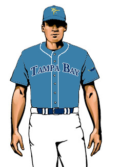
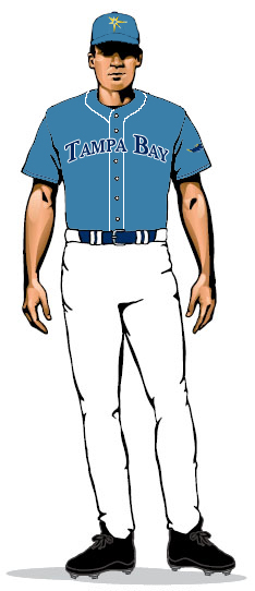
After the new uniforms were unveiled there was considerable uproar among Rays fans that the team's new uniforms will not feature "Tampa Bay" on the road uniforms. When asked about this, the team indicated that there would be an alternate uniform unveiled in 2009 that will feature "Tampa Bay" across the chest, without any further details.
Could the cap being worn by Joe Maddon be the cap associated with the yet-to-be-unveiled alternate uniform? This would make sense as it is the alternate color and features the new "sunburst" which the team wants to become the new identity of the franchise.
We took this new cap and tried to project what the alternate uniform would look like and came up with the following image found at the beginning of this post. If people thought the new uniforms were boring. If the alternate uniform looks like this, it will be anything but boring.
Rays' Maddon Cooking Up Another "Thanks-Mas" Feast [TBO]
Joe Maddon's Thanksmas returns bigger and better [Devil Rays]
Rays To Feature Alternate Jersey In 2009 With "Tampa Bay" Across The Front [Rays Index]
Labels: Joe Maddon, New Uniforms
posted by The Professor at 11:17 AM
![]()
![]()


11 Comments:
That alternate would be awesome! Easily better than the current uni.
That alternate would be awesome! Easily better than the current uni.
A couple of notes.
1. The font was a complete guess.
2. I would not be surprised if they replace the "devil ray" log on the sleeve with a sunburst logo. i am hoping not, as that would bother me
The new hat looks like Batman just punched the guy in the forehead and there should be a gigantic "POW" above the player
are there any other teams in the league right now that have hats (regular or alt) that does not feature any letters?
i am not absolutely sure about alternate caps, but the Orioles and Indians just have logos on their caps, and the Astros have a star which may or may not look like an "A".
the cards have a hat with just a cardinal on a branch on it.
it is sitting on a bat, but yes, that is the Cardinals alternate cap
Looks like the Astros logo.
looks just like the Royals and Blue Jays powder blue alternates that will be used this year
In one of the other pictures, one of the hats looks like a normal rays hat, but with the light blue brim? Doesnt look that bad.
Post a Comment
<< Home